Joy. Mental health app launching
Designing MVP version, generating visual language and product launching
Goal
Joy is your personal AI burnout assistant, which diagnoses the stage of burnout and builds a personal plan to prevent it.
The Joy team consisted of product managers, developers, analysts, professors and scientists who compiled a methodology based on psychology and scientific research.
My goals:
Develop a product design based on the company's researches. Prepare an extended UI-kit that can later be used by the Joy team, developers and future outsource members. Develop a visual language that will be used in the UI, content and external marketing materials. Prepare high-fidelity prototypes of the key features for interviews with users.
How I found a solution
Since we had to work on the product from scratch, the first stage of work was a market research. We searched for references, analyzed methodology used in Joy and ways to reduce burnout level. After that, we prepared a user flow to determine the application structure and understand the scope of work.
An additional important step in the search for insights was interviews with 10 users showing them high-fidelity prototypes of key features. Feedback from the interviews was discussed within the team, prioritized the main points and sent them to the tasks backlog.
What was done
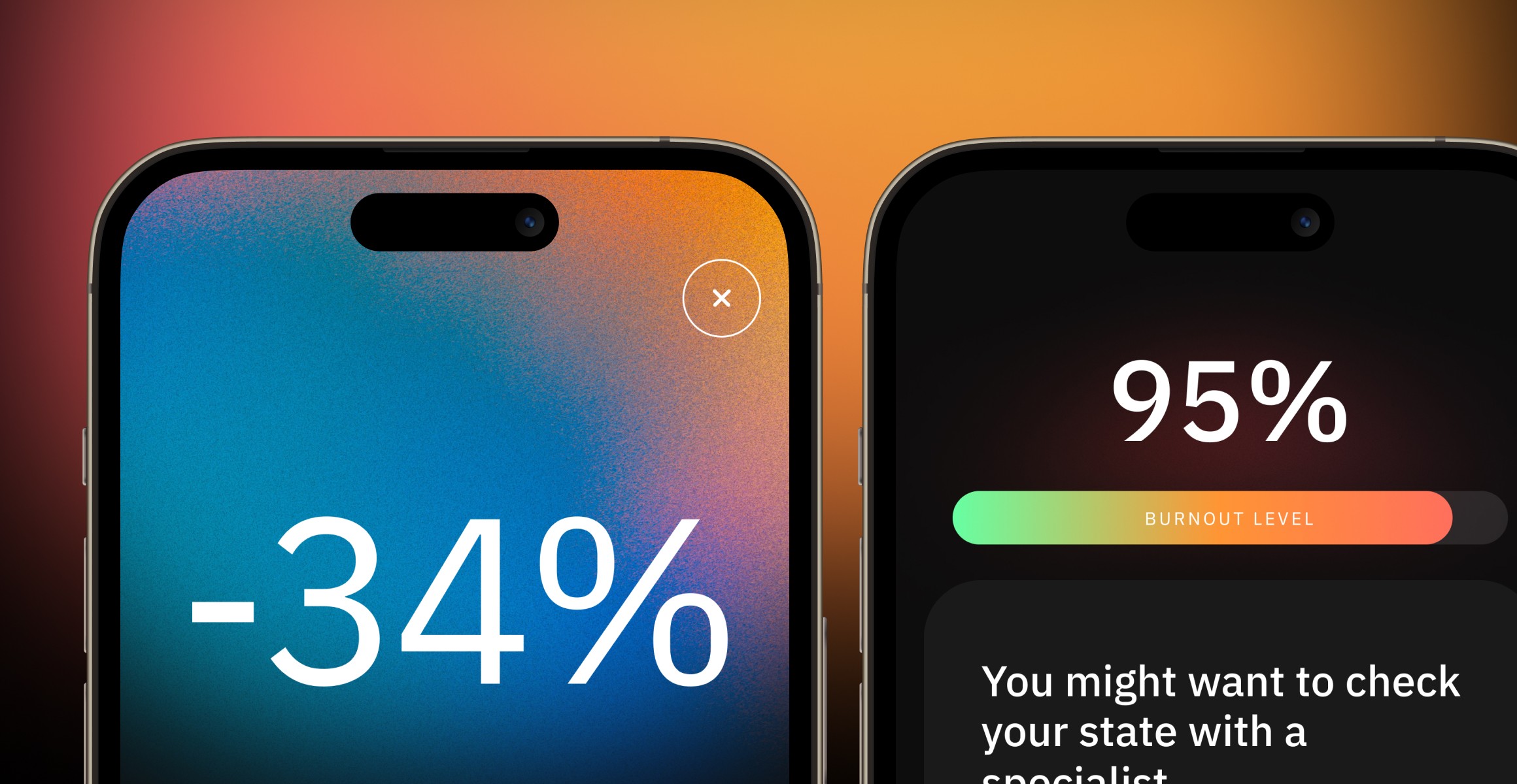
It is common for mental health apps to use light and calm colors that are not associated with negative emotions. Based on our researches, we decided to use a dark theme to stand out from other products, but use a gradient system and bright colors to keep association with positive feelings.
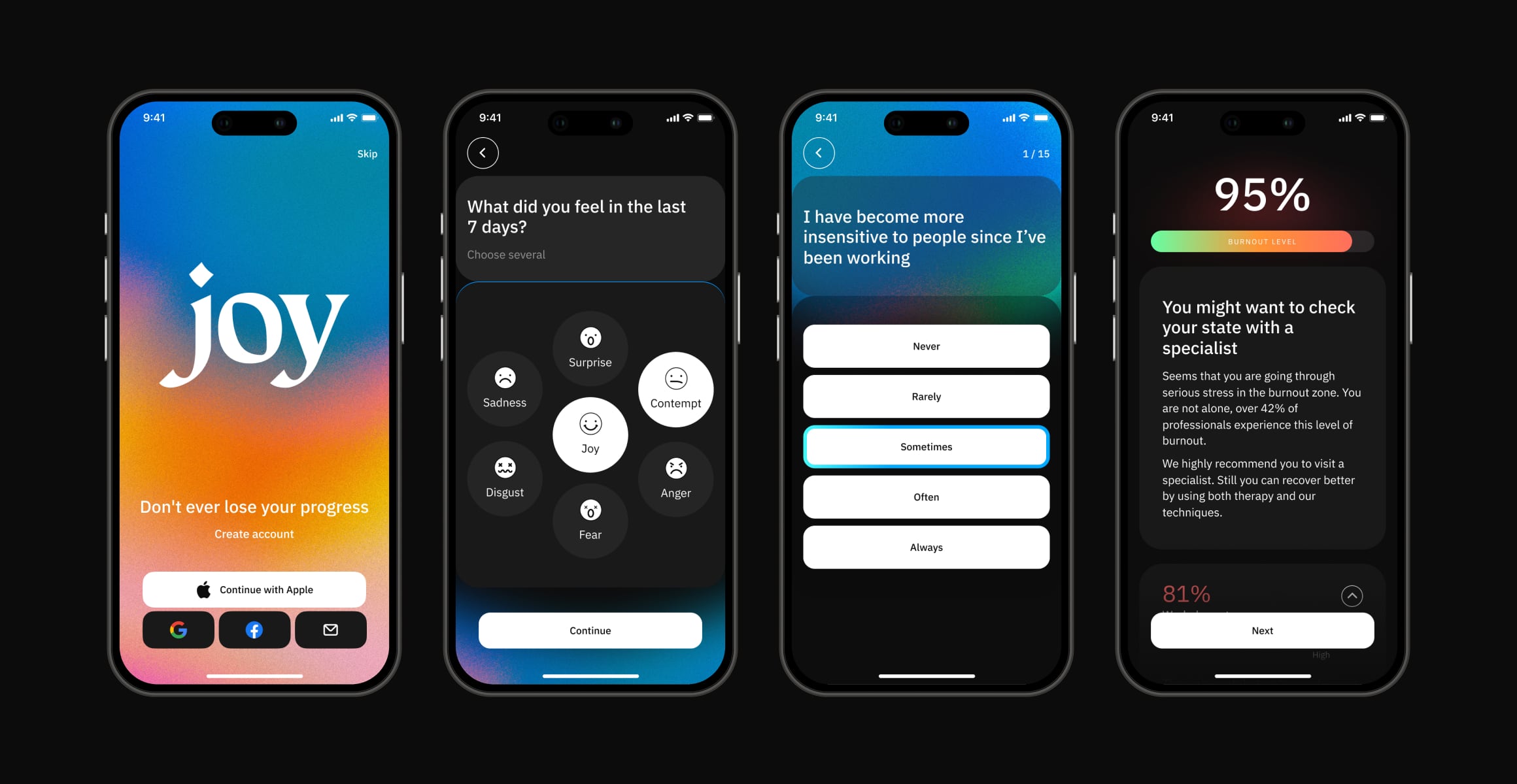
When the app is launched for the first time, users go through onboarding that helps them get acquainted with the functionality of the app, determines the level of burnout, and suggests ways to reduce it. If we understand that the user's burnout level is too high, we suggest contacting professional doctors.
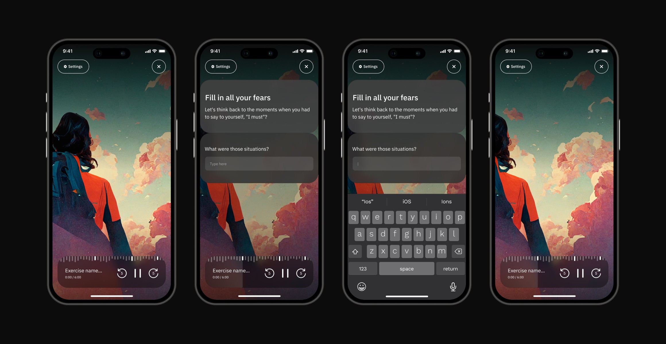
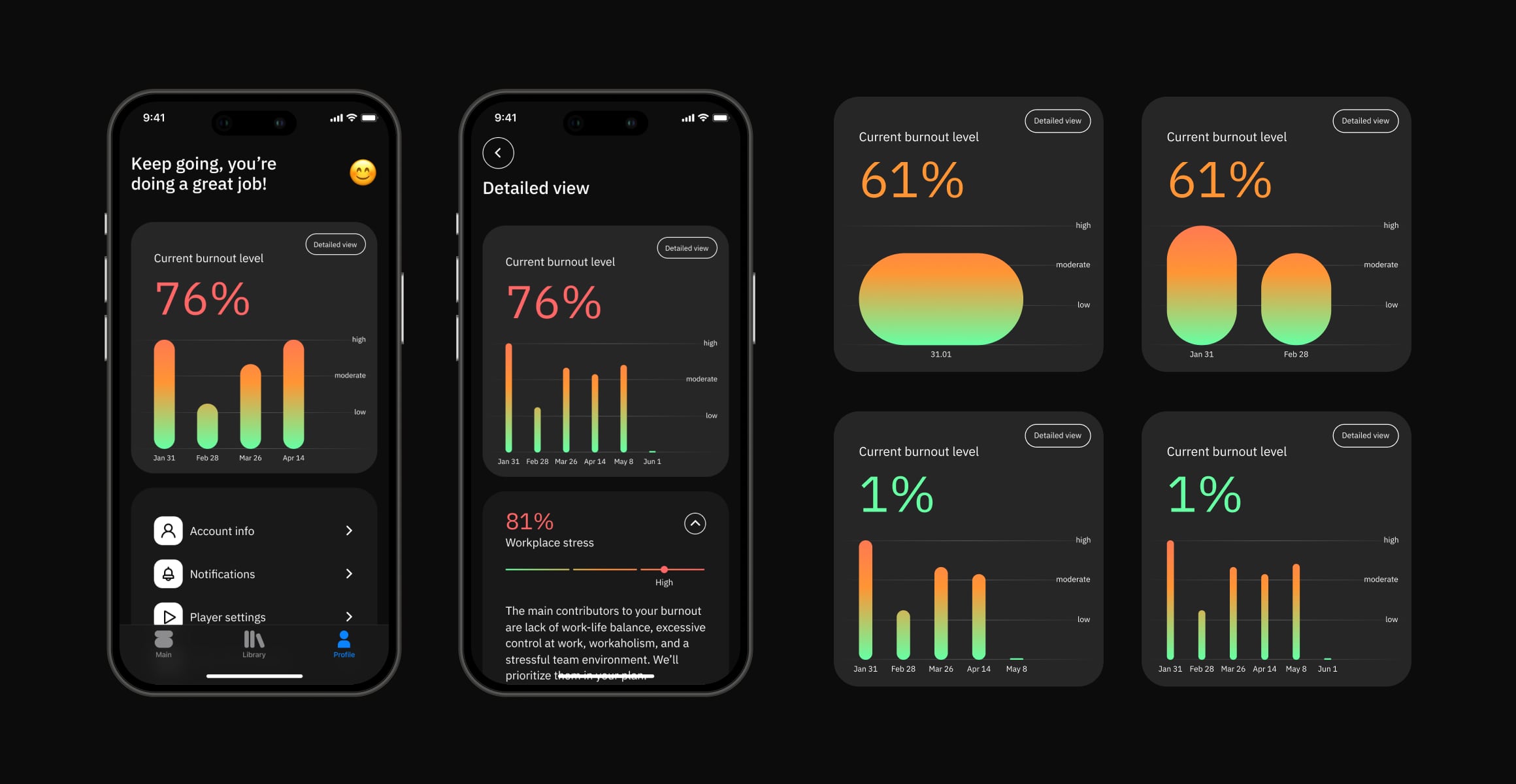
On the main tab, users are offered a personalized list of exercises, which is divided into two types: audio and text. Each exercise updates the level of burnout and allows you to follow changes in dynamics. For a clearer display of statistics, there are graphs that users can explore in the profile.
All UI elements are based on a modular system that can adapt to different amounts of content and be used in different contexts. And with the use of AI-generated graphics we managed to create a common visual language for the entire product.
Personal findings
The application has been reviewed and published in the store. But there are not enough results with in-app key metrics. This data will be updated.
Interviews with users on high-fidelity prototypes were successful, allowing some hypotheses to be confirmed and bugs to be fixed out before the launch. The hypothesis that mental health products should use light and calm colors was not confirmed. Many respondents spoke positively about the dark theme and showed that bright accents with a dark theme evoke associations like "Hope" and "Bright emotions" and "Light at the end of the tunnel".
Since the target audience was IT professionals, there was a tricky issue to receive useful feedback without professional deformation. So, we interviewed a product manager, who gave a bunch of product advice, but not user insights.
The modular UI system reduced development time by 12 hours thanks to flexible components and reusable styles.
AI-generated graphics for content design took 5 hours. It was almost 10 times less than we estimated it with an outsourced illustrator. That allowed us to reduce the development time and not expand the budget.


